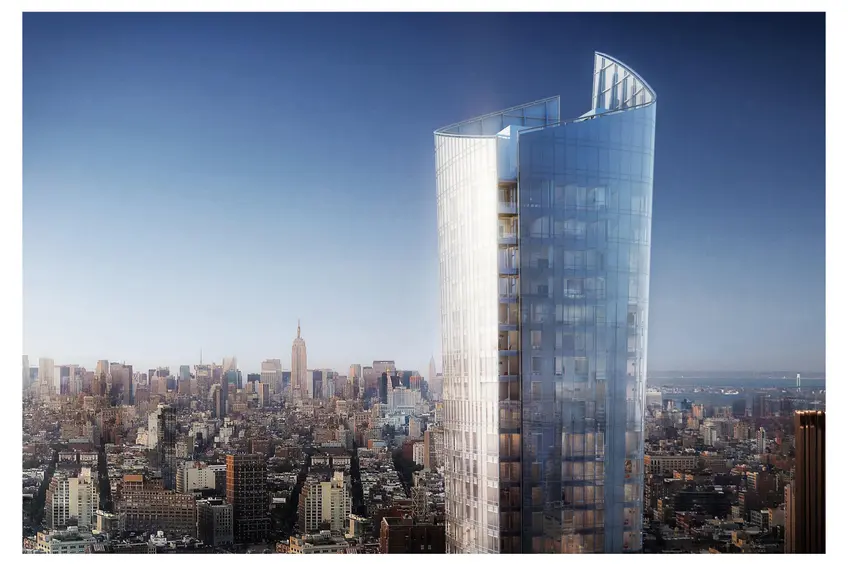
 Rendering of 111 Murray Street's crown via Kohn Pedersen Fox
Kohn Pedersen Fox architect Robert Whitlock designed the standout rising 111 Murray Street, which is boldly growing on the downtown skyline. Whitlock’s inspirations for the building’s unique design span from an ancient Chinese drinking vessel to a folded shirt collar, and 1950s Dior fashion photography to Murano blown glass. All of these diverse inspirations come together to form a distinctly unique and beautiful structure that not only aesthetically pleases but functionally provides growing floorplates as the building rises, an abundant amenities program, and an experience at ground level that brings the beauty of the crown to the street.
CityRealty interviewed Whitlock to delve deeper into these inspirations and discover how he studied previous building typologies and then intentionally turned in another direction to create a new standout for the skyline.
CityRealty interviewed Whitlock to delve deeper into these inspirations and discover how he studied previous building typologies and then intentionally turned in another direction to create a new standout for the skyline.
Can you tell me a bit about the design of 111 Murray?
Fisher Brothers’ offices are located on Park Avenue. They are able to see the 111 Murray site from there, but the skyline view is dominated by the profile of One World Trade Center. So their initial idea was that the tower needed to have some horizontal component that could be identifiable in the distant landscape. The idea was that the building should differentiate itself and become uniquely identifiable.In this article:
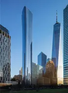
Before Fisher Brothers and The Witkoff Group came to us, they had started developing a design for the site that was very dramatic, with a boomerang-like form on top that would be for the penthouses. But the plan wasn't working and they abandoned it. So they came by our offices to see if KPF could help. I was in Hong Kong during their visit but they saw a model of the tower I designed in Beijing. At 528 meters, the Citic Tower is the tallest building in Beijing. It is a singular standalone office building with a tapered shape part in response to the structural requirements due to the seismic zone. We based the design on the historic icon, a zun, which is a communal drinking vessel. That was the hook on that project. We needed to find cultural relevance for the tallest building in the city. Once we found that, we got the public officials excited about the design. Even though it was a singular private development, it needed to have a storyline that the public could get excited about.
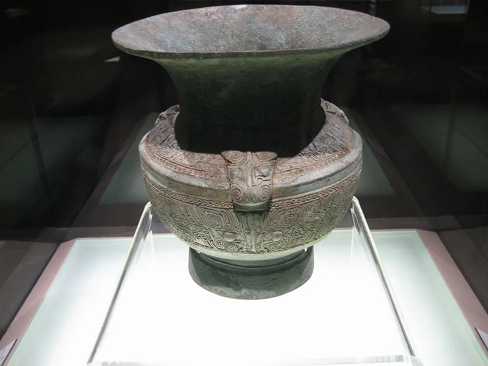 Traditional zun via Wikimedia
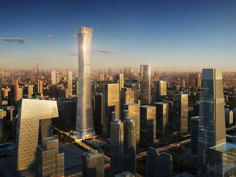 Citic Tower rendering via Kohn Pedersen Fox
Arnold Fisher saw the model of that building and liked the curvilinear corners of the plan and the section that was tapered and not simply extruded. I had just completed the Madison Square Park Tower, and that building has a tapered section. In designing that building we started to explore the more innovative ideas for the internal planning of residential towers. Typically in New York City, residential towers are designed with one floor plate which is extruded over the height of the tower. Therefore, the unit mix is a result of that singular exercise. Fisher Brothers and Witkoff wanted an efficient tower with the flexibility to combine different unit sizes over the height of the tower, culminating in large penthouses at the top. We had to figure a way to assemble a building that gave us the planning flexibility to do so. Tapering the section gave us control of the floor area at any height in the building allowing us to vary the size of the floorplates above and below. We initially had a form that tapered in two directions, like an hourglass, but that placed more area than desired at the base of the building. So we created smaller floors on the base of the building, extruded these to roughly three-fifths of the building height and then we flared out, from 6,500 square feet below to 8,500 square feet at the top.
What were some of the inspirations for 111 Murray?
The underlying premise of 111 Murray was to build a dynamic form, not a simply extruded one. I did a storyboard study for the developers that talked about the history of architecture in New York City. It started with the 1916 zoning resolution that ended up dictating the forms of buildings like the Woolworth and the Chrysler, those campanile forms, which, for the most part, resolve themselves into spires. That form represented architecture in New York City for the first half of the 20th century. Then, in 1958, the Seagrams building transformed New York architecture. That building really provided the underpinning for zoning changes in the sixties. If you look at all the recent super tall residential towers, they almost all fall into Seagrams building-type. 432 Park is a rectangular building. Herzog and de Meuron’s 56 Leonard, with all of its small boxes, is still rectangular. And I’d even argue that New York by Gehry is really just a square building that is decorated.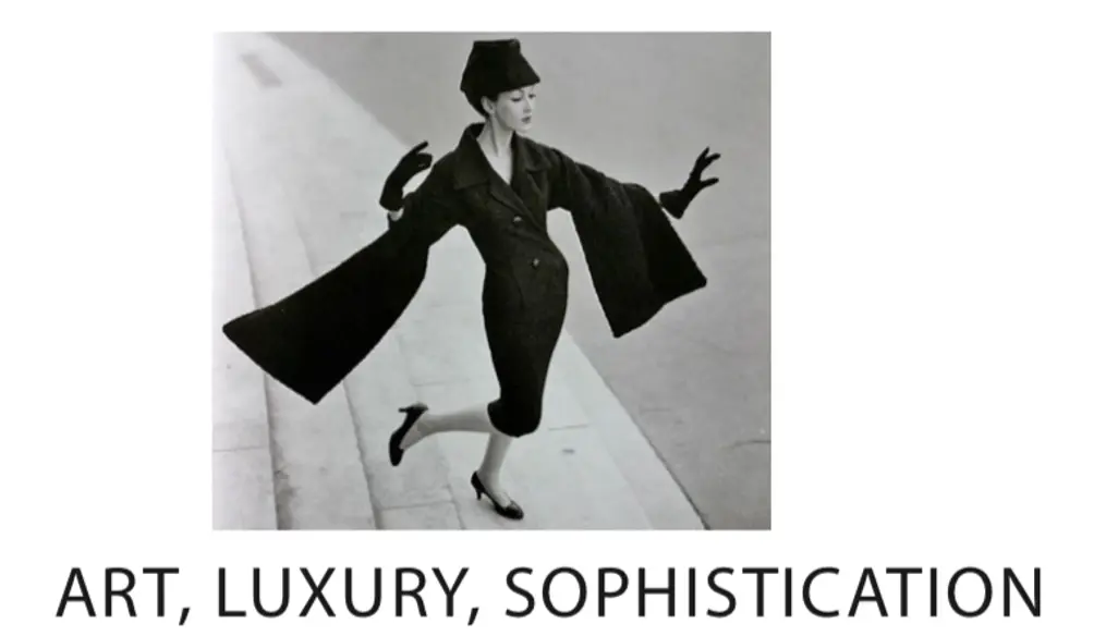 Fashion photography
I suggested that if we move away from those two trends, the rectangular volume and the gradually receding campanile form, we could look to the late 20th century arts for a new model. I was very inspired by Richard Serra’s sculptures, with their curvilinear forms are non-vertical and space making. Additionally, I have always been a passionate amateur photographer along with being an architect. I have always been captivated by Irving Penn and Richard Avedon’s fashion photography, i.e. the Dior fashion from the ’50s and 60s. I like thinking about design in a much broader way, about something other than just architecture. Serra’s sculptures and those photographs are really about dynamism. Serra sculptures push into space. All the Dior New Look collection had pointy edges and contrasting fabrics and a real sense of movement.
The form Arnold saw in the office, while it curved and tapered, was solid and monolithic. One thing about curve forms is when they don’t have corners, they tend to be kind of blobby. You need a corner to create a shadow. The scheme we developed further for Murray Street also took into account the way the building sits on its site. It is a unique residential site where we had a great deal of flexibility about how the tower would be positioned. Because we only had 40% site coverage requirements, we were able to twist the tower on site to position and maximize the views. We were able to not only maximize the interior views but control how the building is seen from its exterior surroundings.
The form Arnold saw in the office, while it curved and tapered, was solid and monolithic. One thing about curve forms is when they don’t have corners, they tend to be kind of blobby. You need a corner to create a shadow. The scheme we developed further for Murray Street also took into account the way the building sits on its site. It is a unique residential site where we had a great deal of flexibility about how the tower would be positioned. Because we only had 40% site coverage requirements, we were able to twist the tower on site to position and maximize the views. We were able to not only maximize the interior views but control how the building is seen from its exterior surroundings.
111 Murray has two dominant views – one moving north along West Street from the World Trade Center and Battery Park City. The southwest corner of the site opens itself up to you as you move towards it. The northeast view was very important to us, looking from midtown to the building. Because of this, I introduced reveals into those two corners. There is a line that comes all the way down to the ground to increase the building’s sense of vertically. Initially, the top floors all had balconies but we decided that it was probably better to have more interior space that was more usable instead of less frequently used balconies. To introduce those reveals, instead of being carved from a solid, we created the tower form out of two thin exterior layers that enter into dialogue with each other. They form a pair of parallel lines from the ground to sky, that meet at the parapet (the high point on the northeast corner to the low point at the southwest top) where we expressed those edges. It is almost like a turned up collar if you follow the edge of a reveal up around to the opposite side. On the northeast corner, the flaring of the tower is a little asymmetrical so the reveal opens up and the curved section flares a little. The northeast corner became a point of visual focus. The building really does clearly stand out on the skyline.
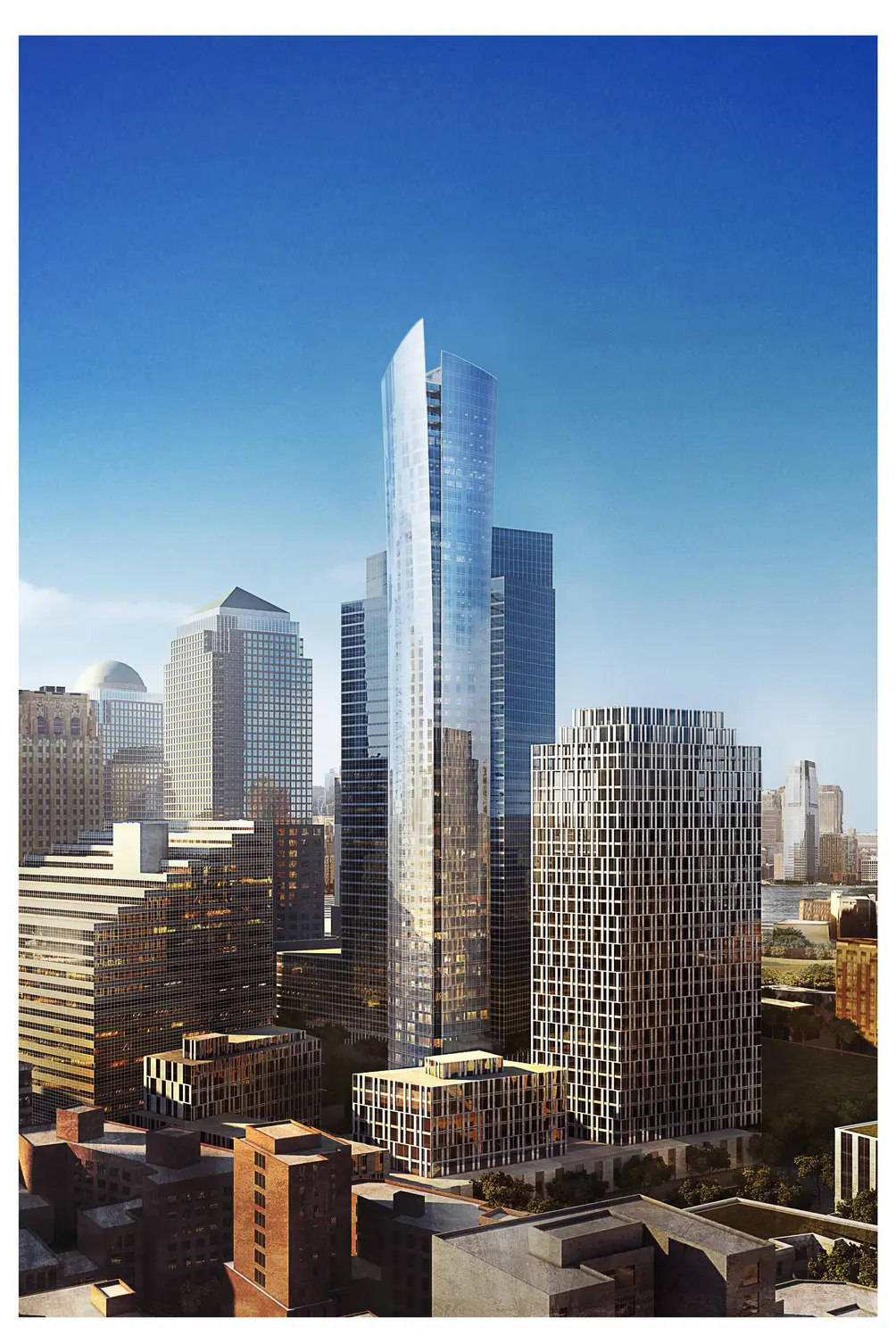 Full-length rendering via Kohn Pedersen Fox
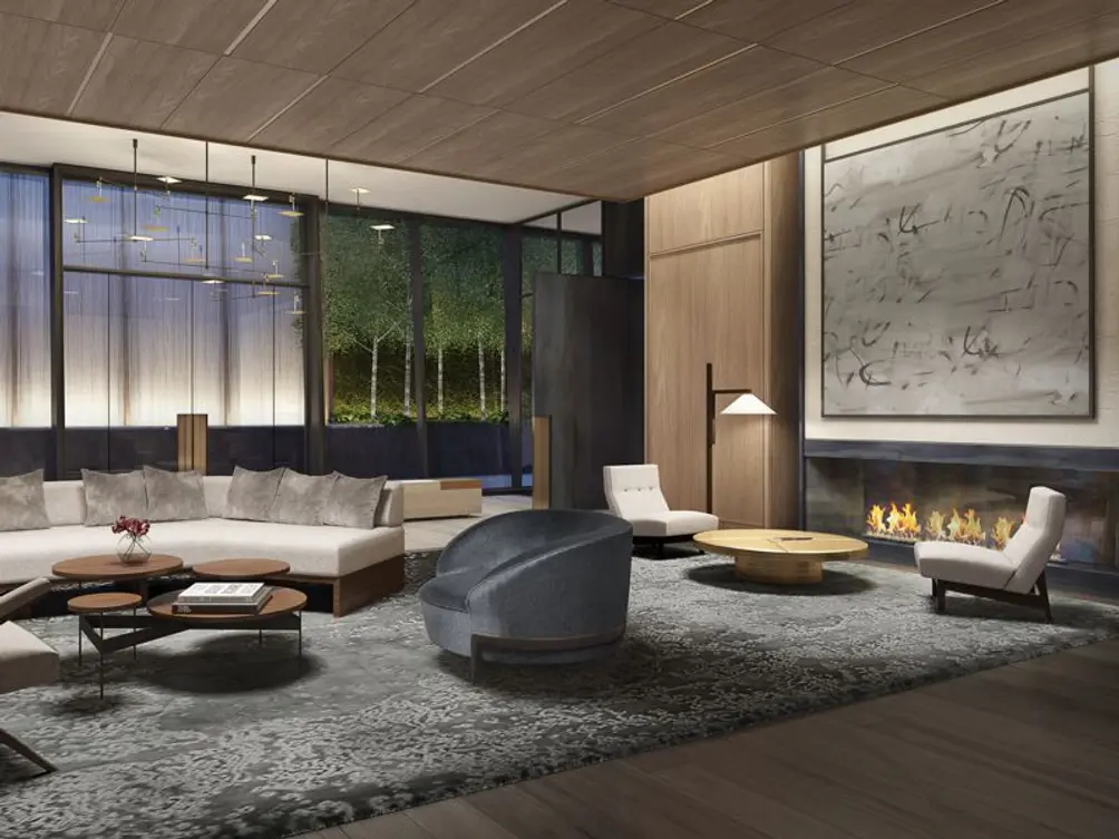
Describe how the building meets the ground.
The way the building meets the skyline was the first and paramount concern early in the design process, but the way it meets and addresses the ground – the way that it creates an address was equally as important. Because the site is so large, Fisher Brothers initially thought to provide a vehicular drop-off on the eastern part of the site. For six to nine months throughout the design process, we worked with that idea. We had developed schemes where the glass cladding of the tower would flare out like an A-line skirt in a spiraling dance to create a big enveloping canopy over the vehicular drop-off at grade. This allowed for the ground level expression to be sympathetic to the moves occurring in the sky. It was ultimately decided to put place a public park at ground level which would act as an amenity to the tower and this required a re-thinking of our approach to entry.The tower’s amenities program is pretty robust – something that Winston Fisher thought was essential to create a world-class residence. It is almost 20,000 square feet, much of which exists at the ground floor, in addition to the lobby itself. We started to think about how we might take the form of the tower as one perceives it on the skyline and bring it down to the ground in a compelling way – and in a way that creates a scale that is appropriate to the street and the pedestrian realm and entry. Initially, I thought of Alvar Aalto’s vases and the way that the undulation of the glass surface creates a sense of space and is dynamic as an appropriate starting point for investigation. Spatially, we have a two-story glass volume that fronts the street and in order to be consistent with the language of the tower above, we treat it as another glass layer concentric to the primary volume of the tower. This surface is not perpendicular to the ground but flares slightly and has a radiused corner. We wanted to take the sweeping curve you see on the skyline and bring down to the street. But where the tower above is a minimally detailed and slightly reflective surface, at the ground floor we wanted to introduce greater transparency so that you can see into the beautiful lobby designed by David Rockwell.. The transparency also increases that visual connection to the landscape of the adjacent public garden. Then, addressing the street, there is a cantilevered canopy, finished in the materiality of the lobby, that reaches out to the curb.
 Amenity area via Kohn Pedersen Fox
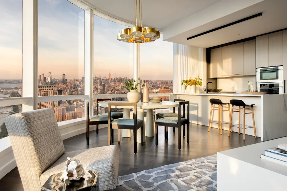
The common ideas we tried to pull through the entire tower were movement, dynamic form, and a sense of space. We had a rare opportunity not to be bounded by property setbacks. We had the ability to do something unique to distinguish this building from boxy competitors that fill the market. The sales unit is really remarkable and successfully shows the radius corners of the towers. You can imagine that if you have a square tower, there have columns in the corners to support the slab. But as we started to move from a square to a curvilinear form, by introducing that radius we didn't need column anywhere near there. We could bury the columns in the back, in the solid walls. So the living rooms, which face northwest and southeast, have entire curved, panoramic views. The unbroken views feel like you are just hovering above the city.
At one point, the developers asked us to think about a name for the building. They wanted something that was part of the design process. We started thinking about Murano glass. Even though that was not one that of the formative inspirations during the design phase, the idea of being handcrafted, like blown glass, is very much what we intended. We wanted to create a bespoke building that was outside the norm of what was expected.
At one point, the developers asked us to think about a name for the building. They wanted something that was part of the design process. We started thinking about Murano glass. Even though that was not one that of the formative inspirations during the design phase, the idea of being handcrafted, like blown glass, is very much what we intended. We wanted to create a bespoke building that was outside the norm of what was expected.
It looks like you succeeded!
 Model residence via Kohn Pedersen Fox
Would you like to tour any of these properties?

Contributing Writer
Michelle Sinclair Colman
Michelle writes children's books and also writes articles about architecture, design and real estate. Those two passions came together in Michelle's first children's book, "Urban Babies Wear Black." Michelle has a Master's degree in Sociology from the University of Minnesota and a Master's degree in the Cities Program from the London School of Economics.